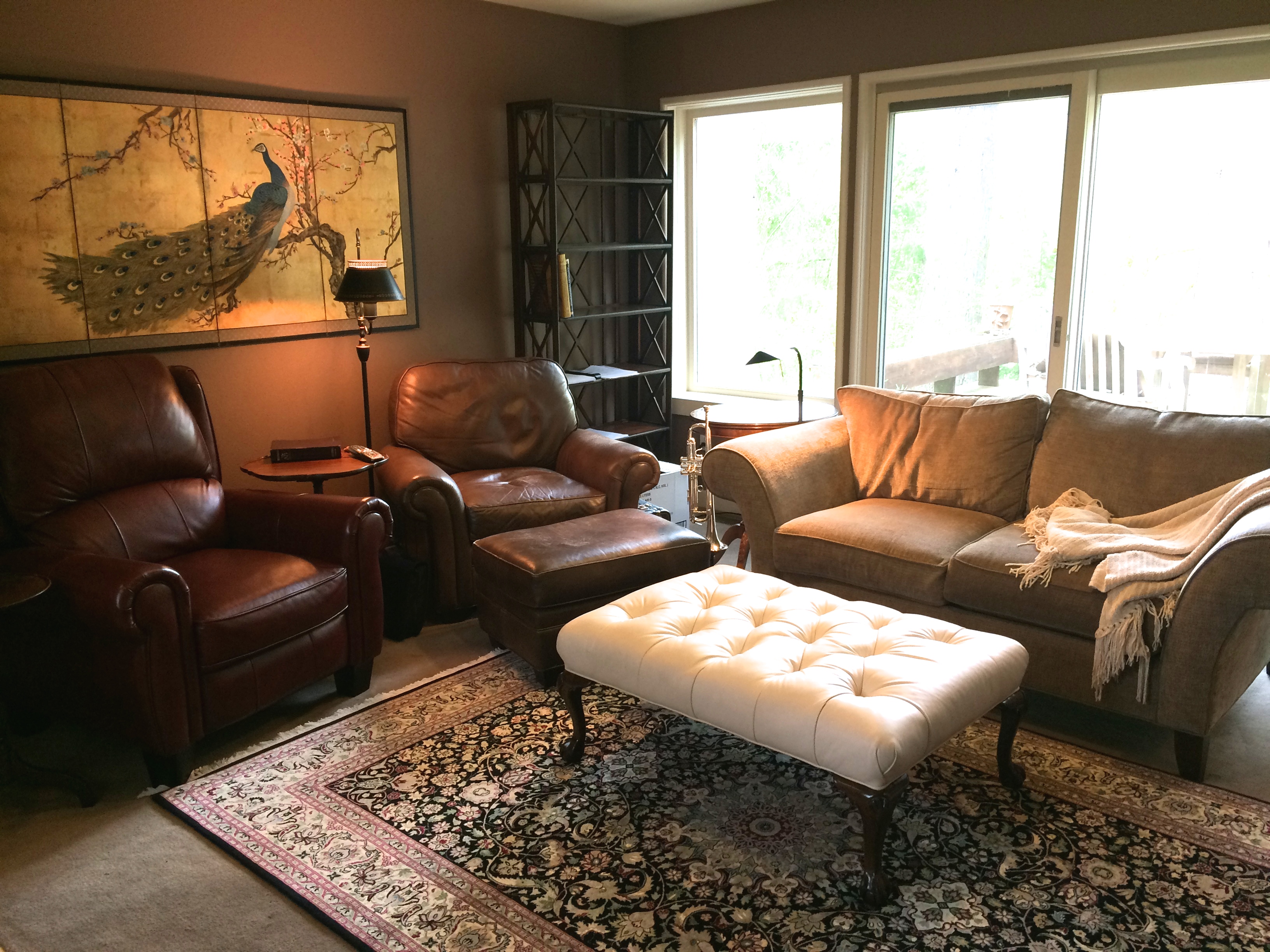
This room felt congested, over-furnished, and lacked flow. By editing a few pieces, and angling the seating arrangement, we made this room into an inviting sitting/entertaining space. Hiromi’s sitting room “before”:
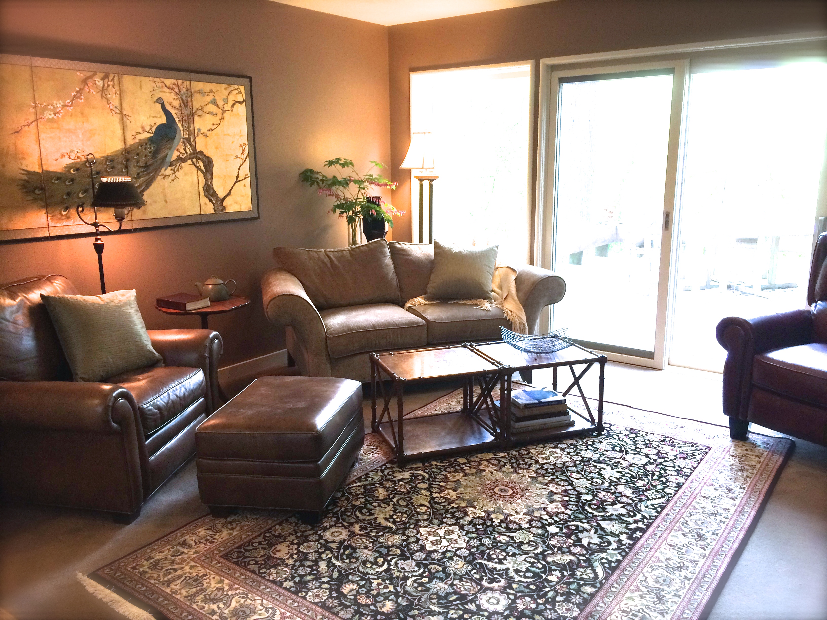
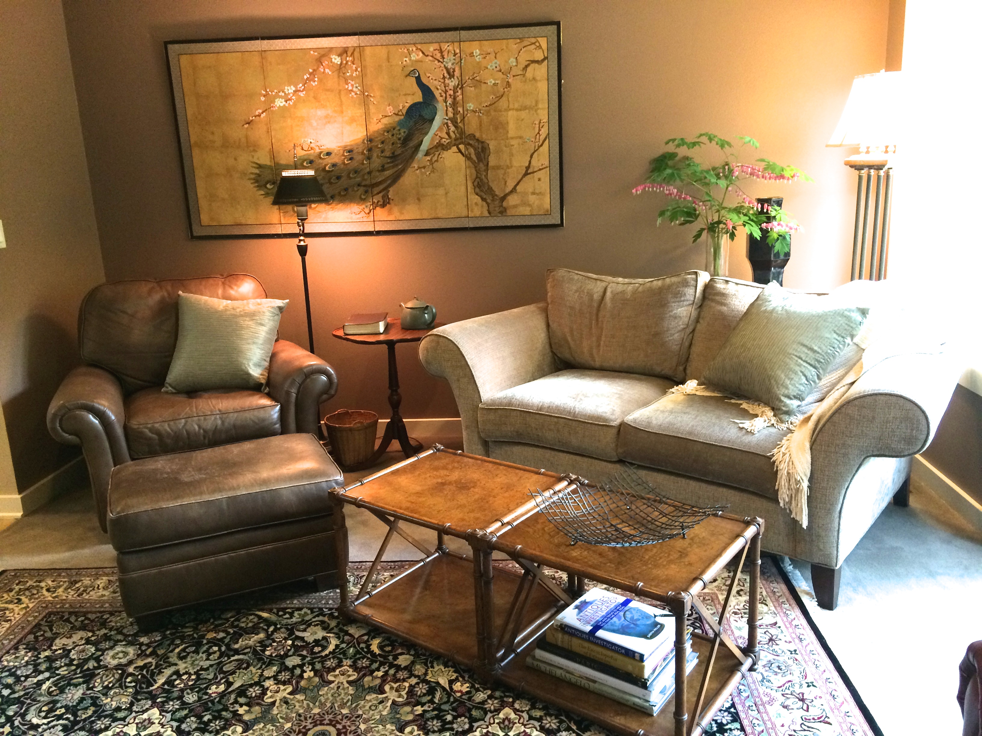
By moving the sofa away from the sliding door, we brought in more light and function to this room, now it’s easy to make indoor/outdoor living happen.
A clever use of space behind an angled piece of furniture is to use a sofa height table for display. You can’t see it, but it’s perfect for vase, flowers, etc.
By de-cluttering your space, you can actually create a cozier feel. Make bold moves when editing your room, so that you can sense the actual flow and use of the room. Hiromi’s sitting room “after”: (courtesy of room stylist Hilary Bailey Burnett)


Leave a Comment